
As a young grad student, I was deeply annoyed when I was asked to think about what color I was using in my graphs. My thought was "The colors are distinguishable, therefore I have hit diminishing returns and will spend my time on other things." I now see this as understandable but flawed thinking. If you are a scientist in training of any kind, you are also a graphic designer and writer in training. This surprises lots of new grad students in STEM subjects every year. However, scientists and engineers are not trying to be breathtaking, original graphic designers. You just need functional graphics and as a result, time spent developing a well-tuned eye for color is a redundant human effort. This article is a collection of all the helpful resources on color use I have come across.
For more on a philosophy of graphic design for quantitative communication, I highly recommend the books of Edward Tufte [1,2,3,4].
When the colors selected need to denote categorically different things, a number of people have worked out ways to do that so you do not need to waste a lot of time picking out colors yourself. You just need to know where to find appropriate style guides.
Paul Tol has written a lot on this topic.
D3 ordinal colors has several aesthetic palates to choose from.
Matplotlib has some named colors and the tableau color palate is published there.
Material Design by Google is a tech giant's attempt to help with the color selection problem.
The Sunlight style guide for data visualization also has some options which are good for low complexity data (where 2-5 colors are sufficient).
Wes Anderson's movies have inspired a blog of color palates which may be of interest.
Then there are color palate archives on the net which are so numerous, they do not actually help a person make a decision: Colorhunt, ColorDrop, Coolors, LOLcolors, and Pigment.
Every color your computer can display is describe by a combination of red, blue, and green intensity values scaled from 0 to 255. This is why we refer to the computer as 256 bit color. Because those color values vary independently, a screen can display (or at least the software can try to display) \(255^3 = 16{,}777{,}216\) different colors. If we want to use a computer screen to display data, we need a mapping from our data values to our screen colors. This function is called a colormap; a function which takes in one parameter and returns three (a red, green, and blue intensity).
where
To use a colormap, in Python, MatLab or any other package, you rescale the data so the max is either 255 or 1 depending on how the software is set up. Then apply the function to the data and plot as a heatmap or image.
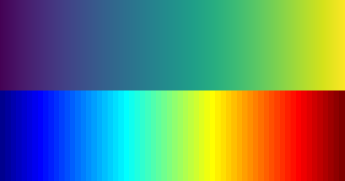
I used the viridis color map because it is the most perceptually uniform color map I am aware of. Jet is the default colormap in many applications. MatLab, the ubiquitous computational software of math and engineering, used jet as the default colormap for many decades. Jet is most famous for being a fantastically bad colormap. Physicians who use jet in diagnosing heart disease take longer and make significantly more errors than those who use decent colormaps [5] (at the time of that paper, viridis had not yet been invented so viridis was not used in the comparison). This is a bit of a pet-peeve of mine but jet (or "rainbow" as it is sometimes referred to in literature) is an extremely poor colormap and better options are available [6,7,8]. People have known about and ranted about jet's deficiencies for over 20 years [9,10,11,12,13] and yet here we still are in a world of rainbow-colored non-sensical data-visualizations. Even MathWorks, the authors of MatLab and the organization arguably most responsible for this plague, has now written publicly about the deficiencies of jet without so much as a halfhearted defense of it [14]. For more information on how color processing works and how to evaluate colormaps, see [15].
The replacement for jet or rainbow colormaps is viridis. It is a brilliantly designed, perceptually-uniform colormap [7]. Nathaniel Smith, Stéfan van der Walt, and Eric Firing, the inventors of viridis, make a wonderful and entertaining case for it on youtube.
Applying a potential colormap to a human face is the simpliest published test of perceptual uniformity. If the face looks natural, the colormap is probably reasonable [16]. In the graphic below, we are comparing jet to the five perceptually-uniform colormaps native to matplotlib (viridis, plasma, magma, inferno, and cividis).

[Caption] Here is a most handsome face I found on unsplash.com. Photo credit to Blake Barlow. Notice how decidely not-handsome this man is when his face is displayed with the jet colormap. Compare that to how dashing he looks when rendered with a perceptually uniform colormap. Also notice that in perceptually uniform colormaps, green is always monotonically increasing (since our eyes are most sensitive to green light). The red is less monotonic and the blue is the least monotonic. The colors which we are least sensitive to are used to the control the hue while the ones we are most sensitive to control the brightness.
[1] The Visual Display of Quantitative Information, 1983.
[2] Envisioning Information, 1990.
[3] Visual Explanations: Images and Quantities, Evidence and Narrative, 1997.
[4] Beautiful Evidence, 2006.
[5] "Evaluation of artery visualizations for heart disease diagnosis," IEEE Transactions On Visualization and Computer Graphics, vol. 17, pp. 2479—2488, 2011.
[6] "True colors of oceanography: Guidelines for effective and accurate colormap selection," Oceanography, vol. 29, pp. 9—13, 2016.
[7] "Somewhere over the rainbow: An empirical assessment of quantitative colormaps," Proceedings of the 2018 CHI Conference On Human Factors in Computing Systems, pp. 1—12, 2018.
[8] "Optimizing colormaps with consideration for color vision deficiency to enable accurate interpretation of scientific data," PloS One, vol. 13, pp. e0199239, 2018.
[9] "How not to lie with visualization," Computers in Physics, vol. 10, pp. 268—273, 1996.
[10] "Rainbow color map (still) considered harmful," IEEE Computer Graphics and Applications, vol. 27, pp. 14—17, 2007.
[11] "Data visualization: the end of the rainbow," IEEE Spectrum, vol. 35, pp. 52—59, 1998.
[12] "The Rainbow color map," CERN, 2015.
[13] "The end of the rainbow? Color schemes for improved data graphics," EOS, vol. 85, pp. 385—391, 2004.
[14] "Rainbow color map critiques: An overview and annotated bibliography," MathWorks Technical Articles and Newsletters, vol. 25, 2014.
[15] "A survey of colormaps in visualization," IEEE Transactions On Visualization and Computer Graphics, vol. 22, pp. 2051—2069, 2015.
[16] "The "Which Blair Project": a quick visual method for evaluating perceptual color maps," Proceedings Visualization VIS'01, pp. 183—556, 2001.